Tuesday, February 15, 2011

Perruche perdu 'poster'; further doodling for yuks

Well, I've completed the second side of my new promotional piece:


However, I'm not completely satisfied with my handpainted contact information...it's a little irregular...Luckily, I scanned this before painting in the contact information, and added in the same information using photoshop- I'll use that for my cards.  (Here, once again, is the other side:)


I'm somewhat annoyed with myself, though, for not having checked the 'oversized' postcard template (vistaprint) before- it's a little more vertical than the standard, alas.  I'm unwilling to crop either image, but I'm not sure that the standard side will show the contact information sufficiently (it can't be too small; we don't ALL have eyes like microscopes!).  I'll have to do a test; if it's not clear enough, I'll consider either a) adding the contact information to the 'girl' side (just superimposing on the image) or b) painstaking photoshop additions.  This will not be easy on the 'girl' side (for this side, a 'frame' of another colour might make more sense), but fairly easy on the 'poster' side.  We shall see.  (And that'll learn me to check sizing details ahead of time!)

Finally, some more doodling.  Argumentative rival teas! Once again with the floating heads! Accusatory coffee!


Wednesday, February 2, 2011

Doodling for yuks and another attempt at 'perruche perdu'

As I promised myself that I would, I've been taking it easy and drawing more for FUN and with less self-imposed pressure- it's been good.  I can feel my mental muscles loosening... Here are a couple of the....um, things... that I drew over the last several days:


the above faces the next:

(curse this non-spiral sketchbook, though!)

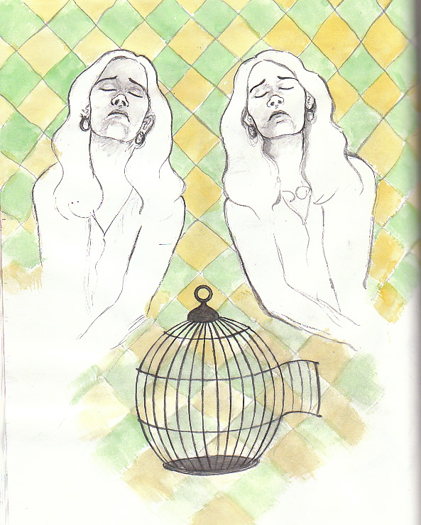
I did also finish another drawing that is a possible 'front' for the 'perruche perdu' card- I've painted a tiny version of the poster here; I plan to do the full-size version of the poster itself next.  I used the same background pattern here as I used in the piece with the two women...I may incorporate the pattern into the poster somehow, too- perhaps something similar to what I did here- just a simple black outline.  I'm working on NOT overindulging in detail overkill...


(hmmm...perhaps the pattern could stand to be a bit darker? )

As part of my recent campaign to relax and enjoy what I'm doing more, I indulged myself in a leisurely visit to the Grande Bibliothèque, where I found a beautiful and inspiring collection of the work of the early 20th century French collective,  'Le Pou qui Grimpe'(link en français only-sorry, didn't find such a thing in English)...here are a few pages:


More to come...

Thursday, January 27, 2011

Various various

I finished the 'perruche perdu' piece that I was working on...s'alright; I'm not thrilled but perhaps am just not receptive to a work-based thrill at the moment.  I plan to continue with my idea of a 'series' for the next promotion-  'pieces' rather than a single image- soon.

I've been particularly frustrated recently (as mentioned in the post previous to this one) with setbacks on the 'flying' book project, and decided to NOT continue working on it in that particular state.  Instead, I've been working on... whatever comes to mind, just for fun.  Here is one such thing:

 
What is it? What does it mean? What is it for?  I don't know...but it was enjoyable.

..Here is the 'perruche perdu' piece:


I'm planning to work next on the 'flying' pages that I've ALMOST completed, which will give me more to add to my online portfolio (one point on which I feel a nagging self-induced pressure/anxiety).  I'll also work on a purely pencil dummy- Diane Dawson Hearn suggested on the PBdummy chat that doing more than TWO finished pieces in a book dummy would give the editor(s) the impression that you would be resistant to change.  (Thanks Diane!  I wouldn't have thought of that myself!)

Ok...that 's all for the moment.  Back soon.

Friday, January 21, 2011

Setbacks and revelations

Hello all.... I've been working but have little satisfactory finished work to show for it.  Yes, yes.... I will tell you my tale of woe...which comes, incidentally, complete with what I am trying to see as a positive outcome. (Oh, it is, it is....it's just hard for me not to want things to work out perfectly, every time, and for everything that I do to be the BEST THING I've ever done, etc....).

So...I've been working on a page for my book...rather desperate to complete ten pages for the SCBWI grant contest as mentioned in the last post. ( I'd really wanted to have completed two new ones already! ) I have long had in mind what I wanted to do.... here are a couple of sketches:


...and here is the pencil drawing before I began to paint:


Well, it turned out...not well.  And it wasn't that I made any particular errors....it was difficult for me to put my finger on exactly what I was not pleased with.  This led to a fairly miserable mood in which I thought of other pieces that I've worked on recently that I had also been less than pleased with....and they  had something in common. But what was it?  And then I realized... that sometimes, my penchant for DETAIL is sometimes too much.... too much detail, on too similar a scale, is not as successful as if I were to use it sparingly or in greatly differing scale, if that makes sense.  I realized that that I had made that very error recently in the pieces that I consider to have been less successful.  My "Heidi" piece, while not terrible, used allover detail (sky and 'grass/flowers') on about the same scale, and the figures were detailed on a similar scale.  Same with the cover that I did for Crow Toes...  Hmmmmm....

So, I decided to minimize colour... in this version, I planned to 'grey/blue' out the buildings and just keep them lightly outlined...and to do a black outline of a pattern in the sky (didn't get to that point here):


...somewhat better, yes?  But then I was able to pinpoint a final criticism of the earlier pieces... again, related to scale.  I really am more effective at tight scenes, not crowd scenes, not 'pulled back' scenes.  A wide perspective isn't what I do best... particularly since I have the aforementioned tendency to detail everything.  Of course, these are things that I can work on... but another consideration is that I have already completed several pages of the book, and want to continue it with the same consistent 'look'...not that I am not already planning to change several pages...  so I began another version of this page:

with the woman's figure in larger scale.  This was difficult to convince myself to do- I'd really envisioned it containing her figure.  I may continue with both.  This one I plan to execute with the more minimal colour scheme also.  So, positive outcome (realization re. strengths/weaknesses as well as things that don't work so well that I will endeavor to reign in) follows despondent mood.

What else?  I started working on the 'perruche perdu' promotional piece; will post that soon.  Was planning to post that tonight but alas, a setback in that piece will delay me until tomorrow or the next.  I'm not terribly upset about this one...just something that needs to be done.

In older news, I went to another 'Dr. Sketchy' drawing session...liked the model a bit less (too much wig, too much feather boa-maybe I was just sitting in an unfortunate location)- but had fun nonetheless and did a few decent drawings.  Here's one:

Ok...that's it for the moment.  Be seeing you!

Sunday, January 2, 2011

Perruche perdu and book dummies; oh my, yes!

It's about time for me to plan, execute and send out another promotional mailing.  In the past, this has taken the form of postcards- colour image on the front with b&w printed contact info/email address on the back.  However, for this next one, I may spend a little more money and print both sides in colour- in fact, I'm considering the possibility of doing two or more versions and sending them out as a series.  It won't cost TOO much, I'm sure...the magic and wonder of Vistaprint never cease to amaze. 

The idea is to make the 'info' side look like a poster- a poster for a lost bird; my contact information will appear where the contact information for the bird's owners would be.  The poster/info side will remain constant even if I do several variations on the front.  The front will feature various people whose connection to the lost bird are vague and open to interpretation- a story of sorts, but one that is lacking a certain amount of information and so is prime for speculation.   I saw such a sign in my neighborhood and found it fascinating!  (I also kept thinking about how I might improve the poster- how I would do it if it were MY lost perruche!)

Here are some of the sketches- please keep in mind that these are REALLY VERY SKETCHY-  I don't think that I've ever posted anything quite so sketchy before- to be honest, I feel a little strange about it- as though I were posting some kind of lurid and probably undesirable tell-all confessional.

These first two images were my first impression- I hadn't developed the idea in any particular way yet.  I imagined a woman passing the sign appearing very emotional, and I just quickly sketched the sign so as to remember what it looked like, more or less:


I developed the idea a little bit more (i.e. at all!) here:


Here are a few sketches of other possibilities- much less developed:

(I'm kind of partial to this one, though!)

(alas, it is not clear that the patinaed man is supposed to be a statue.  He is.)


And here is my sketch for the 'poster' side (still much work to do, obviously!):


Clearly, I'm still in the 'thinking' stage.  I'll be working on this project in the near future; will keep you posted on progress.  However, there's a couple of other things that I'll be working on...


First, I'm going to finish TEN pages of my 'flying' book (the wordless book) to my satisfaction (this, unfortunately for me, is not as easy as I would like!) in order to enter it for the SCBWI's Don Freeman Grant , one of the SCBWI's work-in-progress grants.  I have quite a few pages done...but, as I said, 'to my satisfaction'.  This must be sent in- i.e. postmarked- no later than the 2nd of February- therefore, it's something of a priority.  I love a deadline!  I do, I do.

I'm also going to work on the dummy for this project as part of #kidlitart's 'dummy' challenge.  The entire online group will be sharing their progress on their respective dummies from 6 January until June.  I plan not only to work on the dummy for 'flying', but also for 'Otto', another idea I've had for quite some time now.  It will be good to have a group- virtual or not- to help to keep me moving ahead and not...ahem... re-doing and THINKING about things endlessly as I am wont to do.  Until next time then....

'A Trailer Park X-mas' sketches

Hello all!  Hope that you all had a wonderful holiday.  This will be my first of two posts covering my art-related activities over the last couple of weeks.  First, Dr. Sketchy!  I had long been aware of the existence of a Dr. Sketchy's group en vigeur here in Montreal, but for one reason or another (that reason usually being work), I had never been able to attend.  (For those of you who have not heard of Dr. Sketchy, it is, in short, an essentially burlesque-themed drawing session held in numerous cities around the world.  For more information,  here is the main site. )

Finally, a couple of weeks ago,  I went to a Dr. Sketchy session for the first time (and this was my first life drawing class of any kind for many many years, too!).  The theme was 'A trailer park X-mas' and the model was costumed and adorned with much dollar-store and liquor-store paraphernalia, and surrounded by the likes of a tiny plastic x-mas tree festooned with crushed beer cans.  Campy psychobilly 'redneck-ized' versions of various Christmas songs were played throughout the session.  I enjoyed myself immensely.  I am definitely going to go to the next session next Saturday (January 8th).  I think that I need to buy some markers for quick colouring in these kinds of situations- paint not so convenient. 

Here are a few of my drawings:


Ok, that will be all for the moment.  I will be back with another post later today.  Stay tuned for exciting revelations concerning sketches for my next self-promotion endeavor!  Another SCBWI contest!  And my upcoming participation in a book dummy creation challenge!  More later today.

Tuesday, December 14, 2010

Tomie de Paola award entry, update and previously hidden sketch revealed!

Oh, the intrigue! The drama!
I have completed my piece for the T. de P. award.... well, in any case, I'm done with it. I had been considering the possibility of re-doing it completely with a different colour scheme, about doing it again in a different style... but in the end, I wound up fussing with it so much, I couldn't tell whether it was good, trite, dull, a mess, abysmal, an insult, what have you... but I really wanted to move on to something else. I went to the SCBWI site to check out the entry process...reread the passage selected...and realized, to my horror, that, although I HAD read the passage, I had rather inconvienently forgotten one of the few indications of any kind of specific colours to be used in the composition. I had made her scarf blue, when it was specifically noted in the passage that it was red. I had made one of her dresses red. And so, work continued... and I have learned a valuable lesson. Do not trust that you 'know what it says'...even if it IS something that you have read more than once or twice...print it out. Sigh. Repainting over gouache is not the best thing...but think that this colour scheme is perhaps better than the original- it's not actually much different, although the blue of her dress is brighter than the original blue of her scarf; I like it more.
And so... for your amusement-
First, a cropped scan of the pencil drawing. (As you will see, I am still not sure where to 'cut' this piece)- looking at this crop again, maybe this would be the best? Hm...


And first the WHOLE page, and then a few different crops of the final painted piece (original colour scheme) (sorry, didn't make any scans in the interim!):


...and now, after the colour adjustment:


That last one is the closest to the cropped version in pencil above...I'm definitely leaning towards it or the second-last one; definitely not the full page. I like the increase in verticality in the last crop (I've always been partial to the tall and thin picture- one of my Asian influences, I suppose) and the minimization of the adult figure. In all of the versions, the perspective is somewhat unusual (you don't usually see a cut-off figure) and I think/hope that it emphasizes the child's perspective- and also the arbitrariness of her experience (led by invisible adult forces who knows where). As I've said though, I've lost all perspective/objectivity when it comes to this one...what do you think? (Here I am talking to actual readers, not the internet robots who spam me mercilessly with pseudo-information about any number of drugs that I could buy online!).
I have been thinking about- and the next post will feature some experimentation along these lines- doing some work in a slightly different style; a style more like the way that I sketch (what my first-year university prof Tony Doctor referred to as my 'El Greco' style).
More to come!